
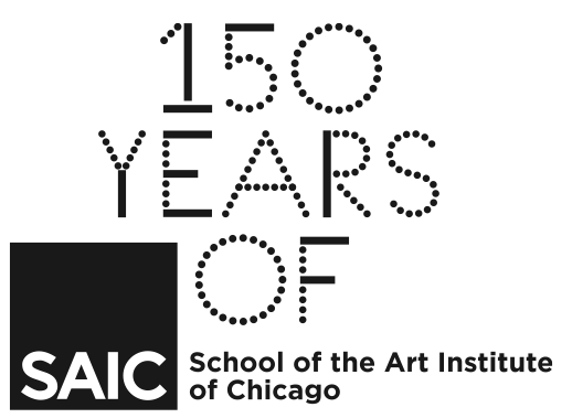
 The School of the Art Institute of Chicago’s (SAIC) 150th Anniversary visual system is a dynamic identity developed to reflect and represent the history, legacy, and current energy of creative makers and art educators.
The phrase “150 Years of” is an open-ended sentiment that sparks the imagination and dialogue between the students, faculty, community, and audiences, both internally and publicly.
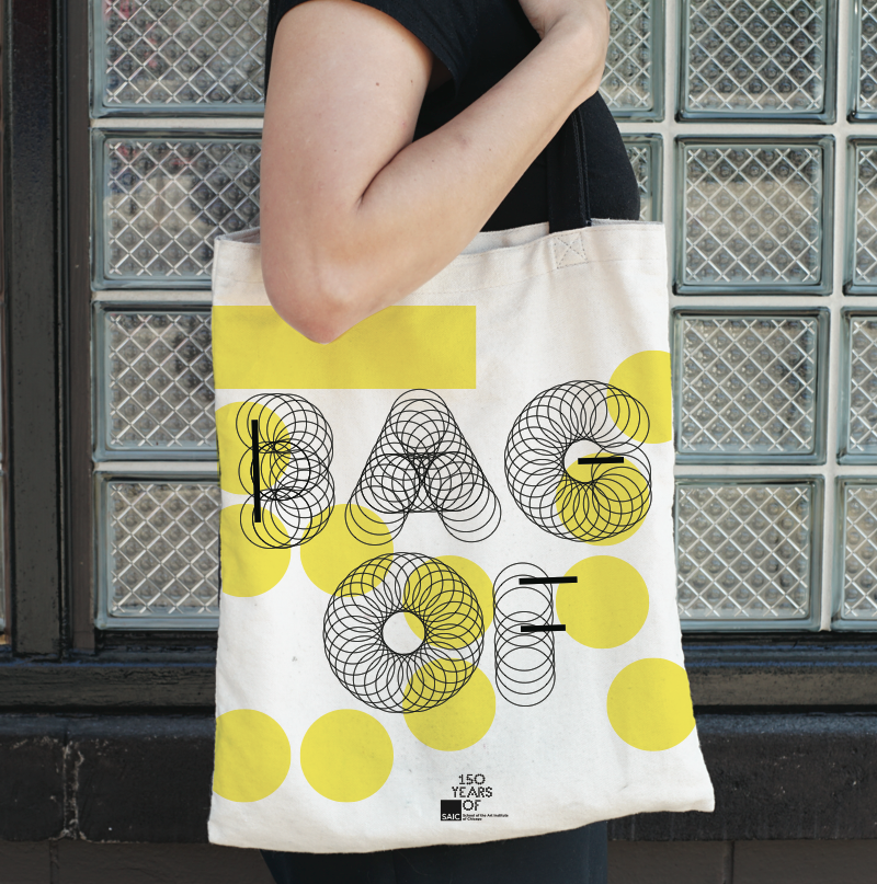
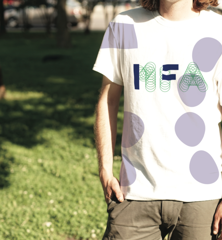
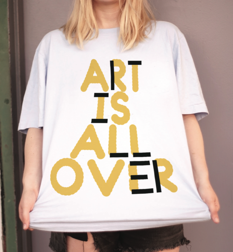
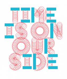
This visual system is anchored by a unique, dynamic typeface. SAIC 150 is not an ordinary typeface—it is specially designed for SAIC as a “type synthesizer” that allows the user to modulate the various attributes of each letterform from size and scale to texture and color. These modulations present an infinite number of combinations—from legible to abstract—communicating as both image and language. The combination of SAIC 150, the two supporting typefaces—(Larish Neue and Gotham)—and selected imagery form the visual language that is the 150th Anniversary visual system.
The 150th Anniversary visual system showcases the spirit of SAIC as a rigorous, open, expressive, ever-evolving, ever-changing, exciting, and engaging art and design school.
When we look back at the legacy and impact that SAIC, (its artists and its faculty) have made, we see influence; we see change; we see risk-taking; we see energy; we see excitement; we see beauty; we see hard work; most importantly, we see fearlessness.
Overview
The purpose of these guidelines is to engage and familiarize you with the visual system and its cohesive implementation across multiple platforms in digital and print media. The visual system is intentionally flexible—meaning, we want you to activate your creative spirit and bring the 150th Anniversary celebration to life!
It is important to understand that by flexible we do not mean challenging. The guidelines and templates will show you how to follow a simple hierarchy. There will be times when being literal will trump abstraction and vice versa.
It is also important to note that this visual system may be different from other visual design systems you have encountered previously. The guidelines are here to lay a foundation, not to restrict you. The intention is to bring the 150th Anniversary celebration to life through your expression using the tools provided. Every poster, advertisement, sign, or banner need not be identical, but rather, will flourish in their differences. The cohesion between applications will become apparent through typefaces, visual hierarchy, color, image, and proportion. Together, these expressions will reflect the energy and excitement of SAIC’s 150th Anniversary.
The following guidelines and examples describe in detail the typeface, logo and lockup, color palette, typographic hierarchy, overall visual hierarchy, design templates, advanced layouts, and examples of the SAIC 150th Anniversary visual system.

Background
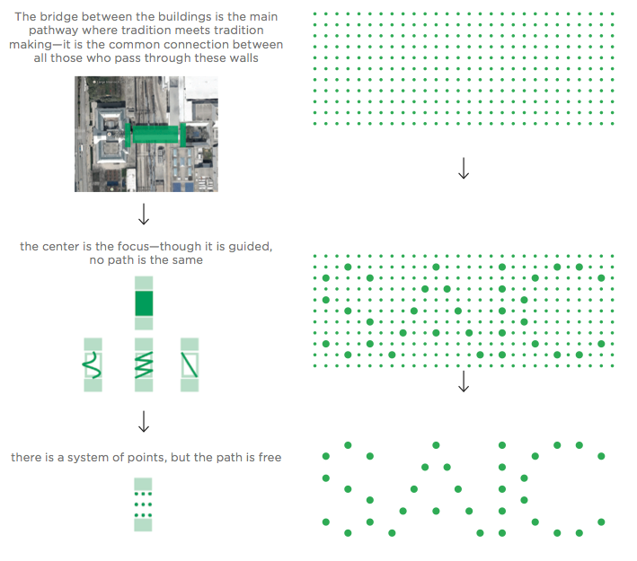
The 150th Anniversary visual design system spawned from a simple idea. The spirit of SAIC is an energy that connects the past, present, and future to the city, community, and culture. The dynamic typeface and design system represent a shared canvas, an open framework, where tradition meets tradition making. There is a stable foundation, but no path is the same.
Typography
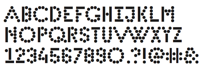
SAIC 150 Typeface
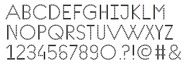
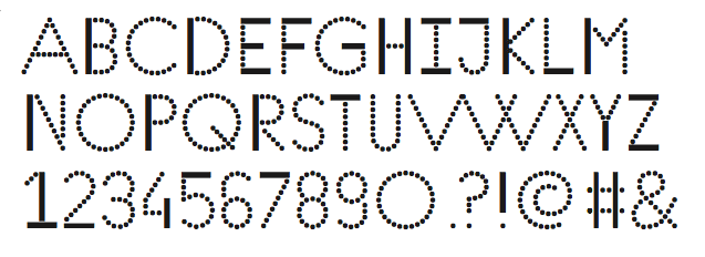
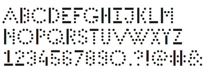
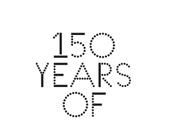
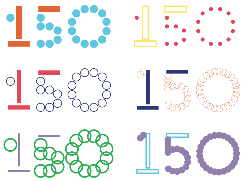
The SAIC 150 typeface consists of two shapes: a line and a circle. The simplicity of these shapes represent a foundation for infinite variation. Using the custom built web type application you can vary the line thickness, dot size, color, and texture of the letterforms.


The web type application is only intended for certain uses. In most cases, the SAIC 150 typeface will be used with the standard digital typeface provided. This typeface includes four weights; Light, Regular, Medium, and Bold. It is recommended that when using the typeface, you do not mix and match the different weights.
SAIC 150 Light
SAIC 150 Regular
SAIC 150 Medium
SAIC 150 Bold
Secondary Typefaces
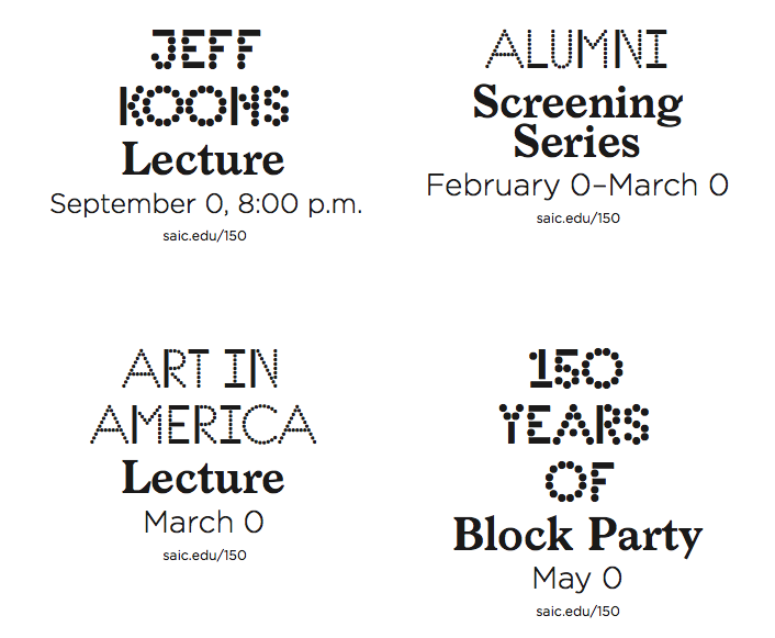
Extending the visual system, Larish Neue and Gotham will be set with the SAIC 150 typeface as supporting characters. Each typeface will serve different information that will create the typographic hierarchy.
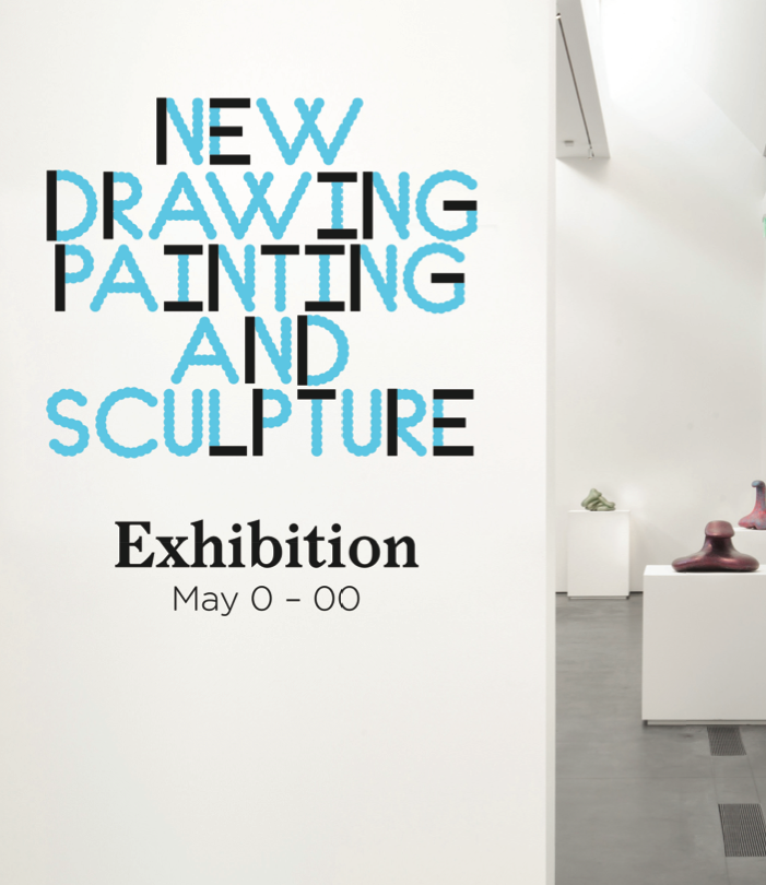
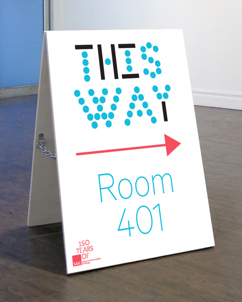
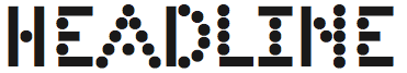
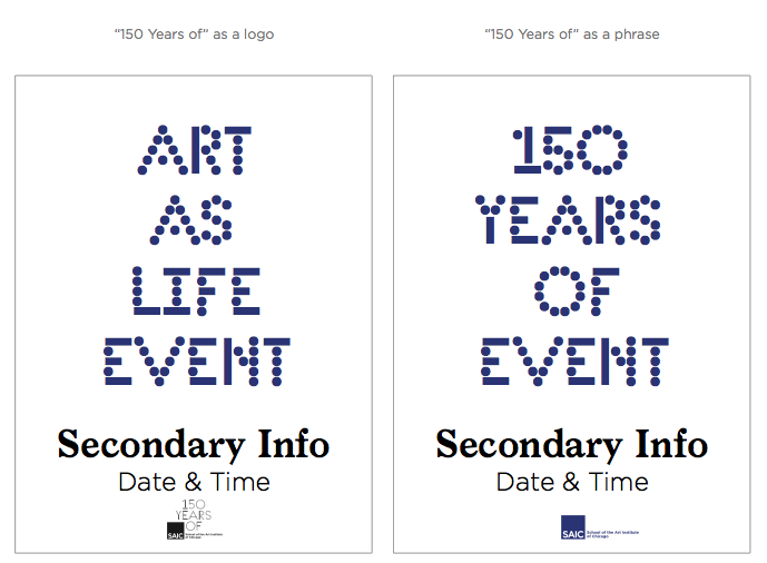
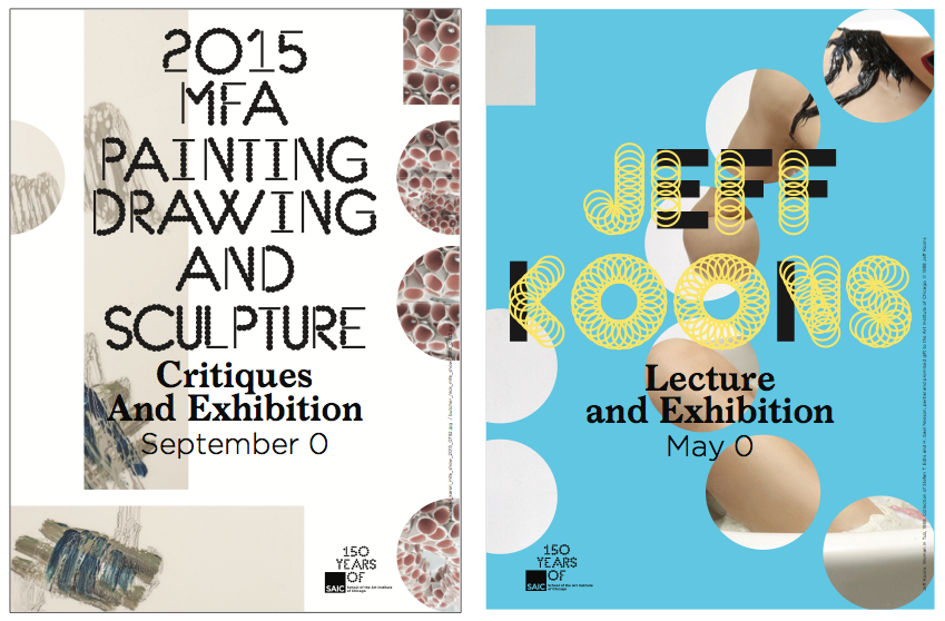
SAIC 150 should be used for the main headline upon any application.
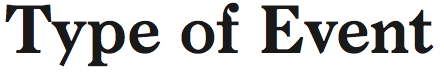
Larish Neue Semibold should be used for the secondary or supporting information—such as series title or type of event.
Gotham Light or Gotham Thin should be used for the detail information—such as dates and time.

Gotham Regular or Gotham Medium should be used only when additional supporting details are necessary—such as addresses, business hours, website links, or social media handles.
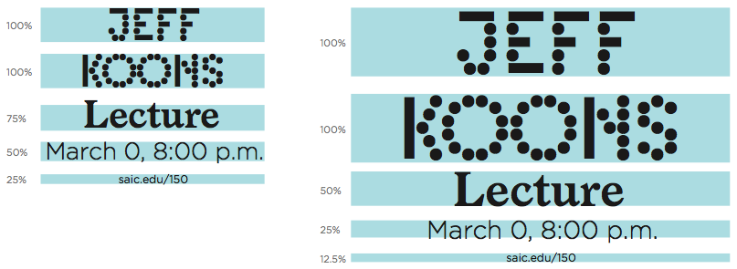
Typeface Hierarchy
Creating a typographic hierarchy across applications helps viewers access information in a specific order without overwhelming the eye. The relationship of styles establishes specific functions for each typeface. It is important to keep these functions unified across all applications to create familiarity with the viewer. When viewers see more than one application from the 150th Anniversary, it is important that they first recognize it as part of the system and then digest the information cohesively.
Typeface Proportion
Proportion establishes the visual hierarchy. It is important to maintain a specific typographic proportion when laying out applications to ease comprehension, breaking content into digestible bits. Proportion creates visual tension and engages the eye in visual poetry.
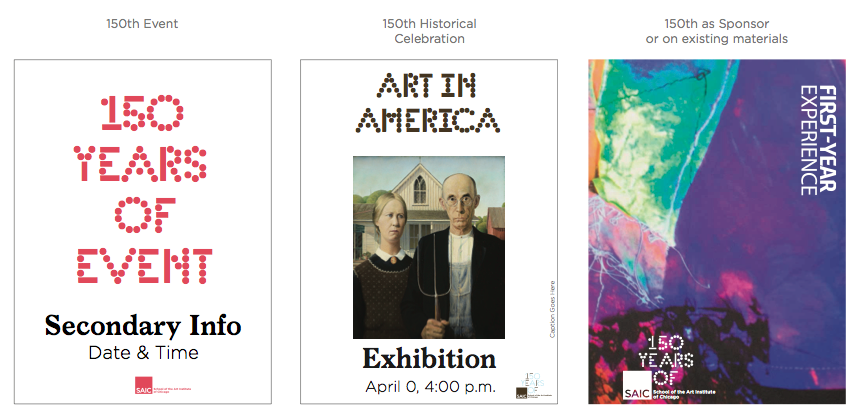
In general, the typographic proportions are kept to simple divisions of halves and quarters. Be sure to utilize this to your advantage. If you make everything bold or everything the same size, the hierarchy is lost and the viewer no longer sees anything. However, if one item is large, and one is small, a path is created that invites the eye to travel.
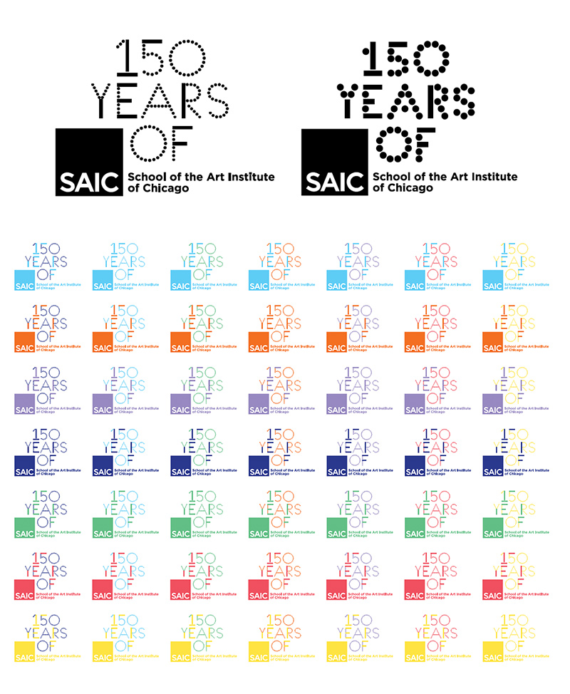
Logo & Lockup
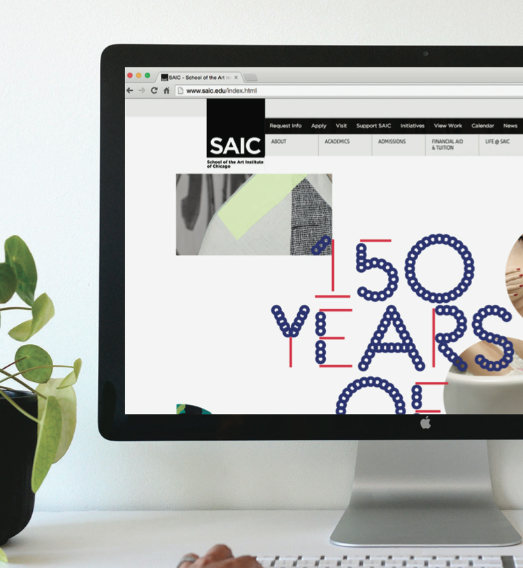
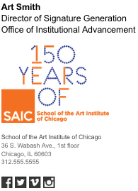
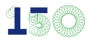
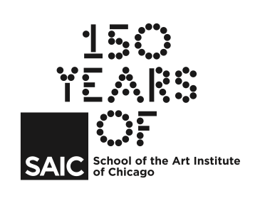
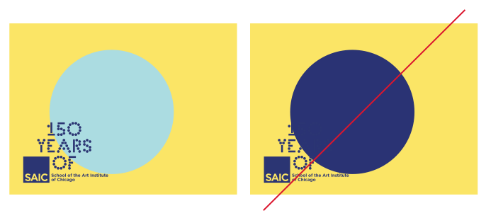
The “150 Years of” logo lockup combines the SAIC 150 typeface with the current SAIC logo. The relationship of the current SAIC logo and the 150 year mark is intentionally set to provide a feeling of forward momentum, or projecting outward.
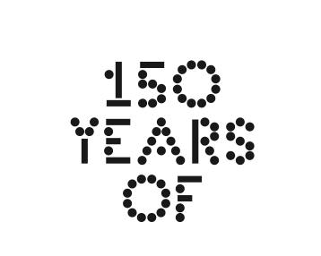
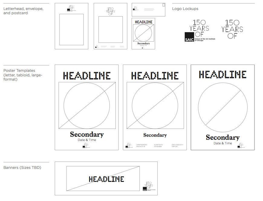
Logo Variations
To further reinforce the dynamic, flexible, and energetic spirit of the 150th Anniversary, there is a logo alternative that you are free to use. This does not mean that you have to use the option.
Logo Use
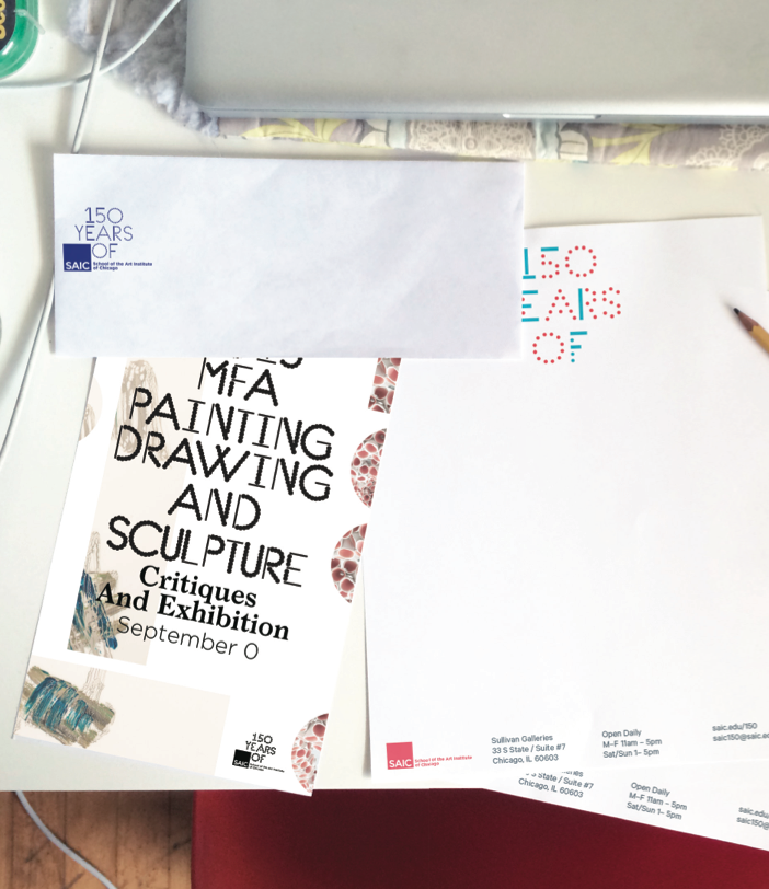
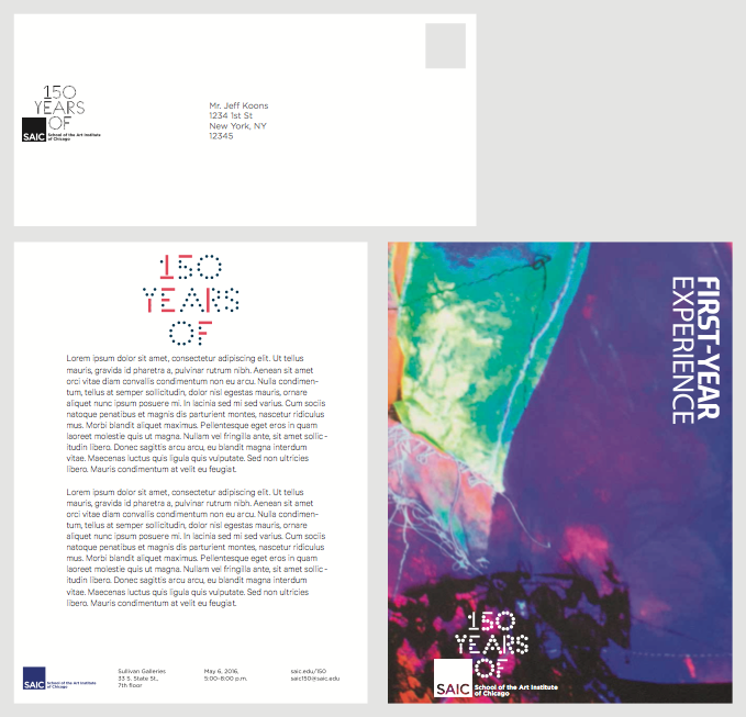
With the 150th Anniversary visual system you will discover instances when it is appropriate to use the “150 Years of” logo and other instances where the standard SAIC logo is all that is needed. The “150 Years of” logo is well-suited to envelopes, letterheads, existing collateral, partnerships and sponsorships, and applications where the primary information is not directly related to the 150th Anniversary but highlighting the 150th year is desired.
In this instance, the letterhead header has “150 Years of” written out. Placing the “150 Years of” logo is not necessary.
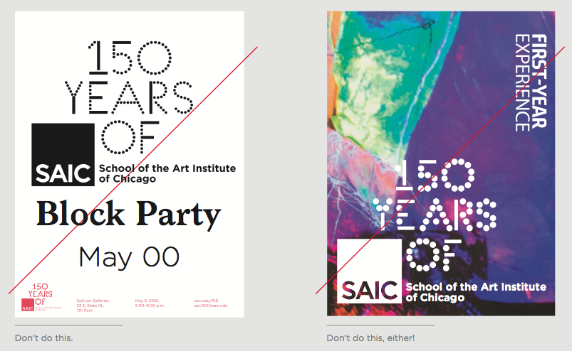
The “150 Years of” logo is designed to be legible, specifically for use at a small scale. It should never be scaled to a large size on any application.
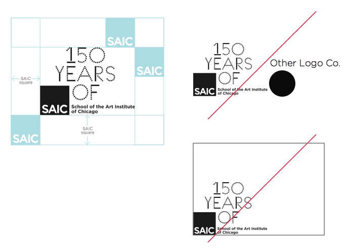
Integrity of the Logo
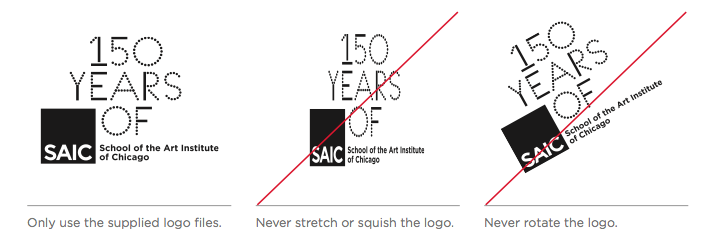
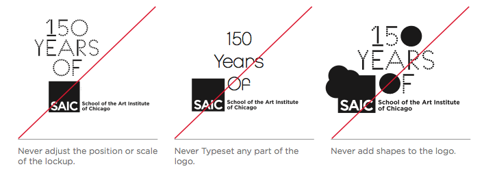
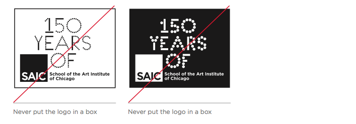
The “150 Years of” logo should be treated with the same care and consistency as the SAIC logo. It should never be stretched, tweaked, distorted, or manipulated in any way. When applying the logo to any application, only use the logo files provided.
Logo Placement
The logo is one element among all elements on a page. The relationship of these elements creates the visual composition. There is no one specific place where the logo is required to live on all applications, but rather the application should inform the logo placement in order to activate the composition.
So, where do I put the logo?
If the logo stands alone without detailed text information, do not put the logo against the edge in any corner—doing so only reinforces the boundaries of the format and creates a static composition. Moving it slightly out of the corner is a better solution. Remember, the spirit of the school is dynamic and the placement of the logo should reflect that.
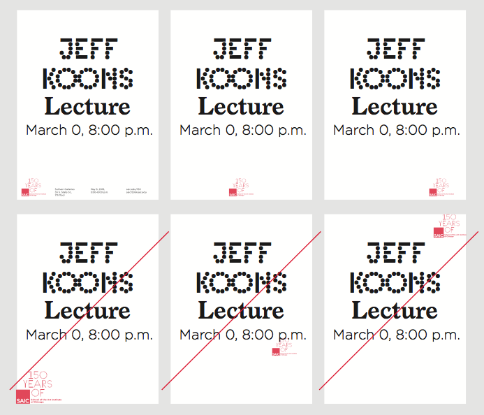
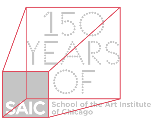
Logo Size & Clear Space
The “150 Years of” logo should never be applied at a size smaller than 1.23 inch square.
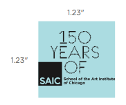
When placing the “150 Years of” logo, a space equal to the SAIC square should be given to the surrounding area. Doing this will avoid confusion with additional sponsor logos or text information.
Logo Contrast & Color Logos
When the “150 Years of” logo is used on an application with colors or textures that interact with the logo, it is important to maintain high contrast so that the logo remains clearly visible.
The same rules apply when using one of the provided color logos.
“150 Years of” Logo vs Type
The phrase “150 Years of” can appear on applications as the headline and on other applications as a logo. The guidelines set for logo use do not apply when “150 Years of” is typeset as a phrase.
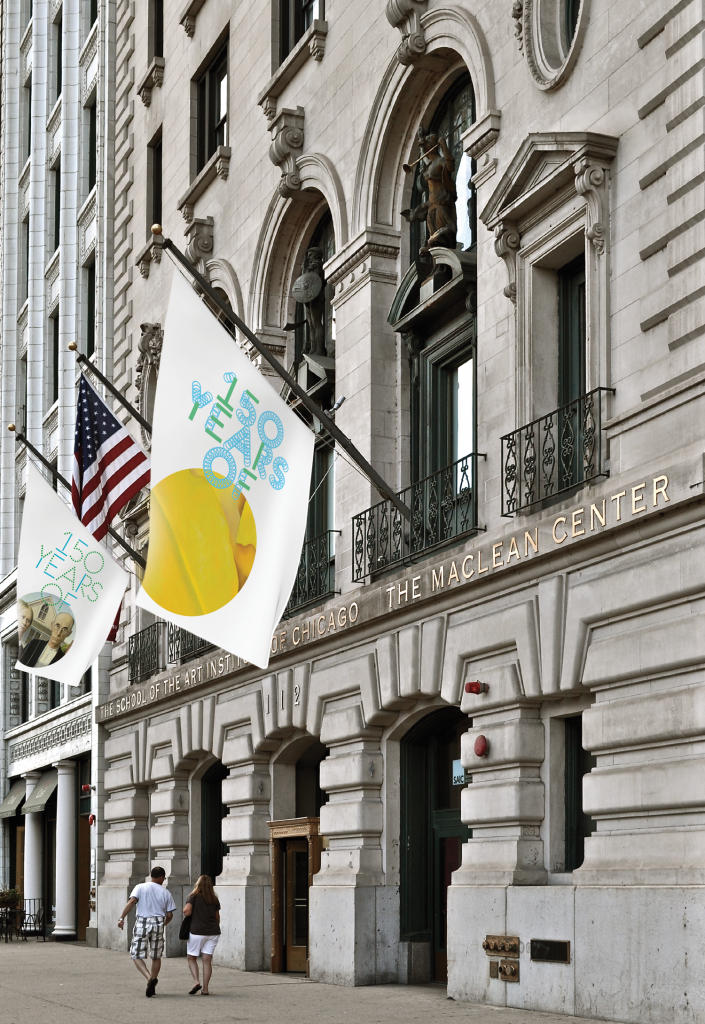
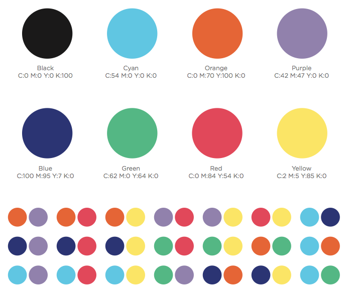
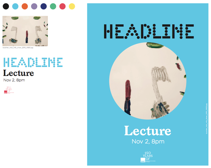
Color Palette
Color brings a vibrant, celebratory energy to the 150th Anniversary. The 150th Anniversary color palette consists of eight colors that can be used in a variety of combinations.
On any single application, you should limit your color usage to two to three colors maximum. A white background is preferred on most applications.
Logo Color
The “150 Years of” logo is available in all color combinations where the dots and lines are either one single color, or separate colors.
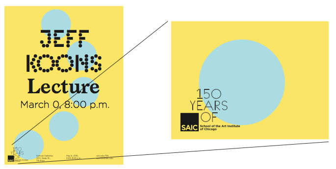
Logo Color with Images
In certain instances, the color palette and the image used on the application may not complement each other. In these instances, it is okay to derive the color from the image to create a stronger visual connection.
Applications and Templates
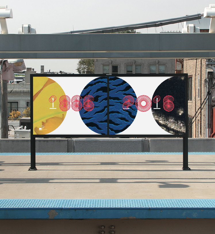
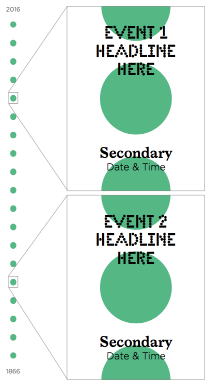
The overall design system for the 150th Anniversary is anchored around a centered layout. The centered layout creates the feeling of a scroll—or continuous connection—reflective of a timeline. The information on each application should feel connected to the overall system. We can think about this idea as zooming in and out of a larger timeline that represents the past 150 years.
Application Types
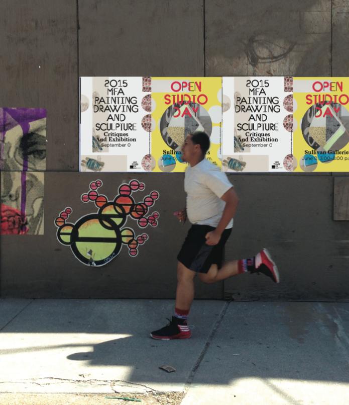
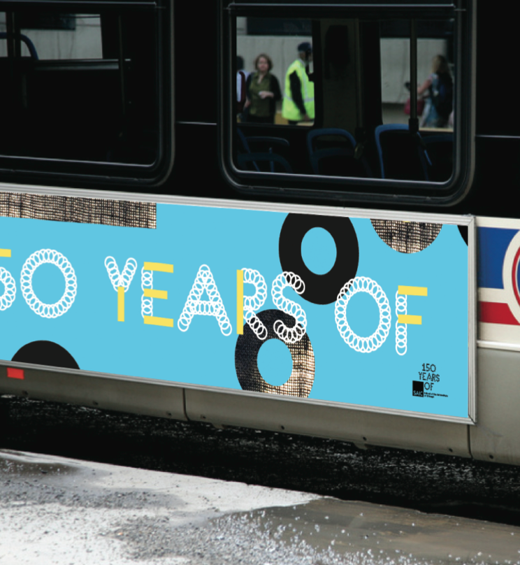
Application types will vary depending on the context. There will be instances where the application announces a 150th Anniversary event, highlights a past artist, serves as wayfinding, acts as internal communications, or is a sponsor of a non-150th Anniversary event. The system is designed to give you the greatest flexibility in these instances. Certain applications will be paired with an image while others will not.
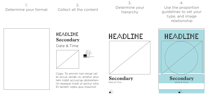
Design Template Structure
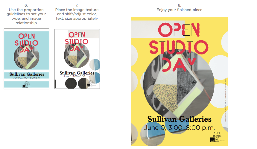
The template structure for any application follows the Typeface Proportion guidelines, as described previously. It is important to maintain a proportional relationship of sizes for each element on the page. The templates provided have been set up for basic instances where there is a headline, secondary information, and detailed information.
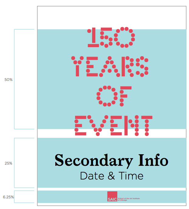
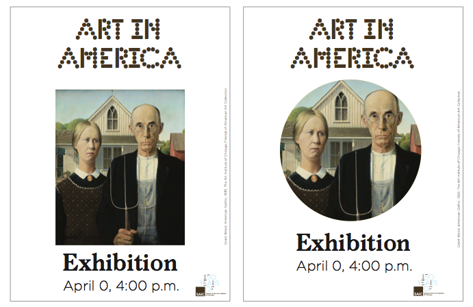
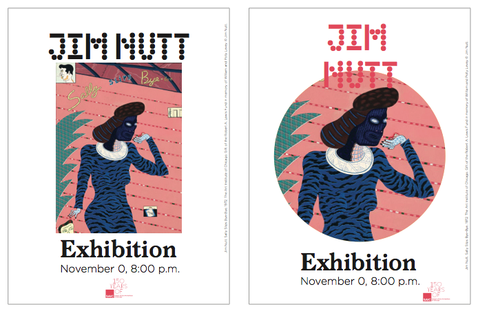
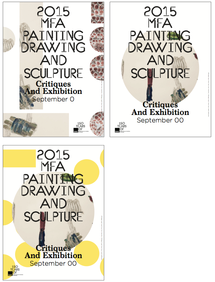
There should never be more than two elements that compete for visual hierarchy. In such an instance, both the headline and the image should have the same visual weight but be treated as a single element. It is okay for the headline text to overlap the image so long as the text remains legible and follows the guidelines for contrast.
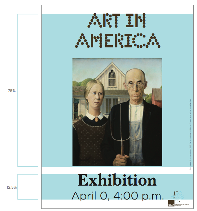
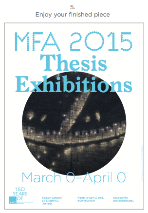
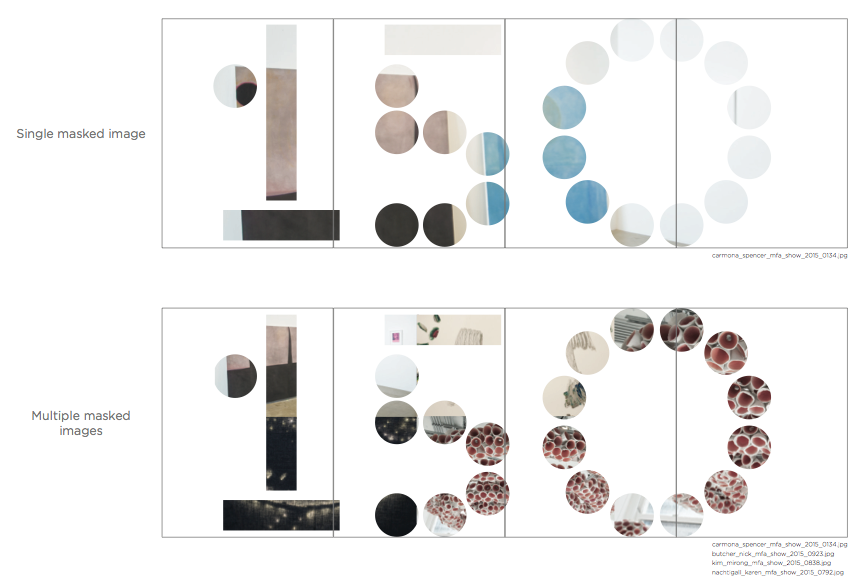
Image captions and credits will be placed vertically on the side of the application. The templates provided include placeholder captions.
The caption can be aligned to the bottom of an image or the baseline of the secondary type.
If there is an instance where you have more copy than the space available, do not be worried. In these instances, first ask, “can I edit any content that is not integral to the immediate communication?” If the answer is no, then you can adjust the template following the guidelines.
Design Template Images
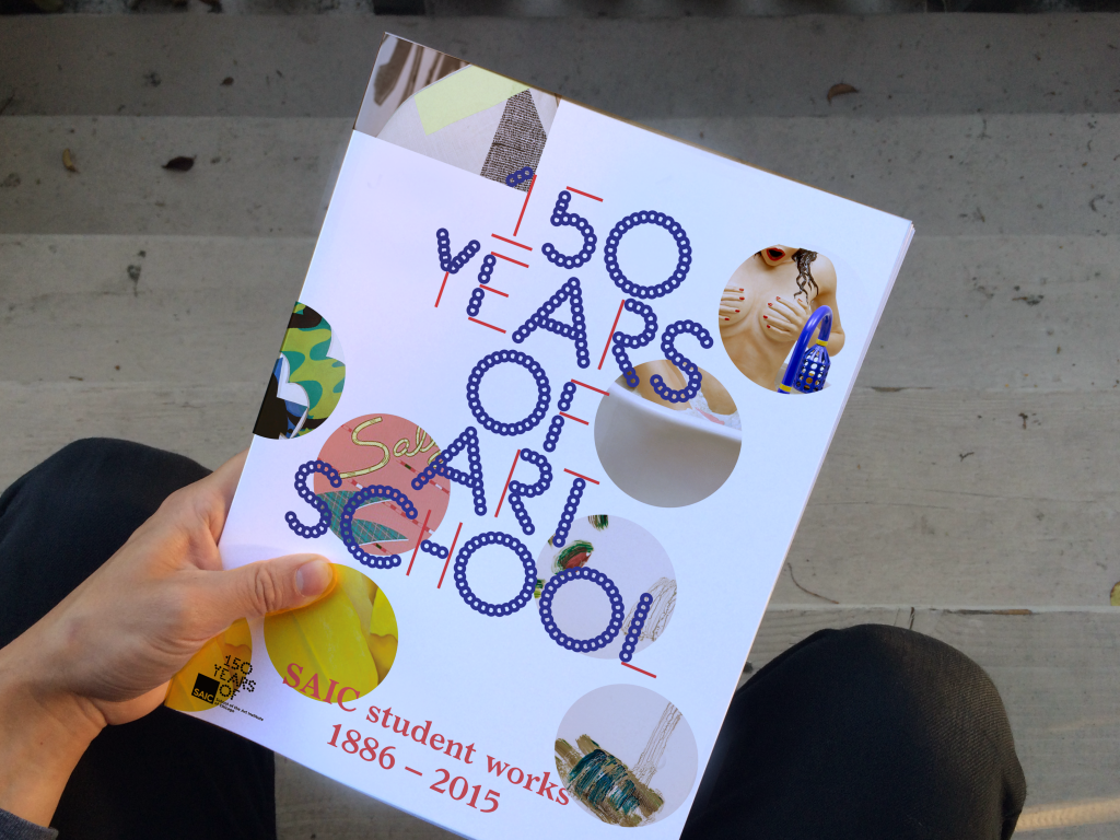
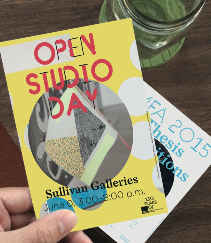
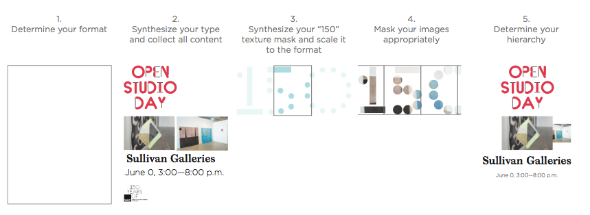
The images on any application can be handled in two ways. If it is essential to maintain the frame of an artwork, the image should be presented in full. In most instances, making reference to the timeline or showcasing multiple images should use a circular mask.
Design Template Textures
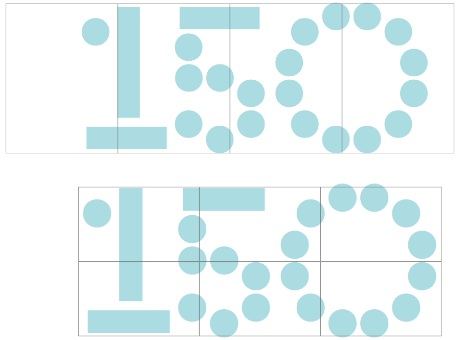
If you decide to apply a texture to the background, a simple rule will help you decide how to incorporate it. Using only the numbers 1, 5, and 0 as the texture options (in the SAIC 150 type weight and color of your choice), scale the “150” so it is as large as your format. You can then choose your ideal crop for your format by moving the 150 left or right.
This creates instances where multiple applications can come together to form a 150, similar to a puzzle.
Application Extremes
There are many variations and choices to consider when building applications. The flexibility of the system is meant to activate your creative spirit, so don’t forget to have fun! The system allows you to create unique applications that function cohesively throughout the overall visual campaign. The templates provide you with a starting point; you can simply plug in your content to the appropriate template and send it to print, or you can play and finesse your unique composition. Some applications will remain simple while some will be more complex or abstract.
How to Build Templates
If you find an instance where the provided templates do not suit your application needs, first choose the template that is closest to your need, then refer to the guidelines in each section to establish the correct proportion and visual/typographic hierarchy.
Advanced Layouts
The following pages explain how to add color backgrounds, apply text using the type synthesizer, and add images into textures. The advanced layouts follow the same general guidelines specified in building a standard application, but require additional steps. These applications will most often be executed in collaboration with the design team to maintain consistency with the overall visual system.
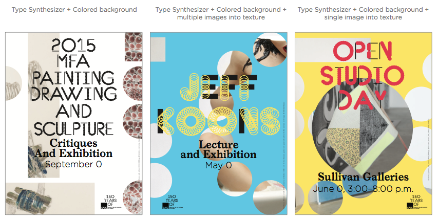
Background Color
If you decide to use a background color on your application, choose a color from the color palette that complements the content. When pairing this with a color logo or color type, all of the content should be legible according to the contrast guidelines. Once you place the content, adjust the text and background color as necessary.
Using the Type Synthesizer
The type synthesizer allows you to generate unique variations to the SAIC 150 typeface and export any text as vector [SVG]. When using the synthesizer, choose colors that reflect the content on your application. Once you have set your copy, color, line, and dot variations, export the file and place it onto your application.
When placing your synthesized text onto your application, adjust the scale and color appropriately using the type proportion and contrast guidelines. Remember, on any single application, you should limit your color usage to two or three colors maximum.
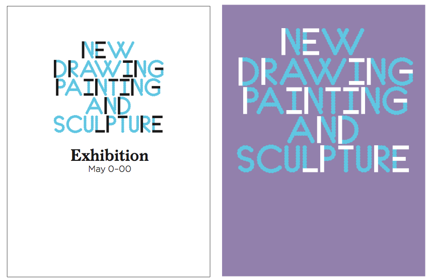
Image as Texture
Following the guidelines for using “150” as a texture, you can mask a single image or multiple images. When using image as texture, be careful with the placement and overall composition so that legibility and hierarchy are not compromised.
Note: The type synthesizer can also be used to generate a “150” with variant line and dot thickness to create different masks.
Variation
Steps
If you find an instance where the provided templates do not suit your application needs, first choose the template that is closest to your need, then refer to the guidelines in each section to establish the correct proportion and visual/typographic hierarchy.
Provided Templates
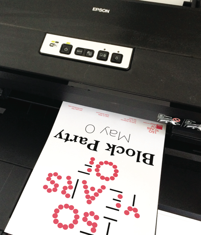
The templates provided facilitate the design of letterheads, envelopes, letter/tabloid/large-format sized posters, postcards, and banners. Each template has a simple, non-textured application, as well as a textured application. For some templates, an additional file is provided for long-form copy.
Lookbook