SECONDARY LOGO: STACKED
Use when the preferred logo construction cannot be placed at or above its minimum size.

INTERNAL LOGO: SQUARE ONLY
Only for use on internal-facing projects where the full SAIC logo has been established. Contact Marketing and Communications at communications@saic.edu for permission and files.
DEPARTMENT LOGO
A FULL SET OF LOGO LOCKUPS WITH OFFICE AND DEPARTMENT NAMES IS AVAILABLE. VISIT OUR DOWNLOAD PAGE FOR THE FULL LIST.
EXTERNAL USE
For use on materials that face the public.



Internal Use
Use on internal-facing materials.



LOGO GUIDELINES FOR PRINT

SAFETY SPACE
Leave an “S” width space on all sides. Stay at least 1/4” from all trim.

STACKED MINIMUM SIZE
1” minimum width

HORIZONTAL MINIMUM SIZE
1 1/2” minimum width
LOGO GUIDELINES FOR WEB

Use the stacked version of the logo.

The wordmark under the square should be omitted for social media profile pictures and situations where the logo needs to be less than 100 pixels.

The logotype without the square should only be used where space is extremely limited and the School’s brand has already been established (e.g., navigation bar on mobile devices).

In situations where the full logo will not fit, include the complete logotype only.
LOGO POSITIONING
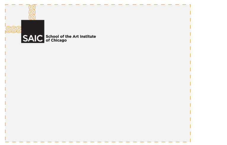
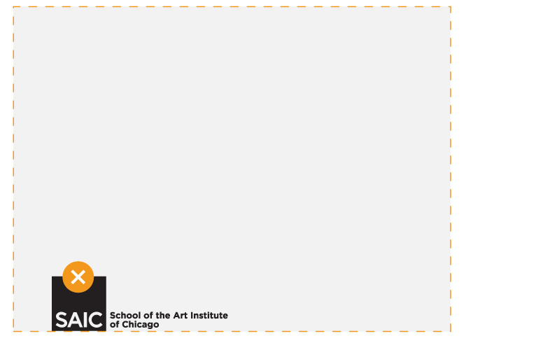
SAIC materials should use the logo as a tag whenever possible. The placement of the logo should be determined by the minimum spacing of the “S” space.
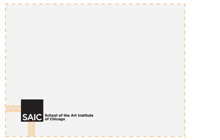
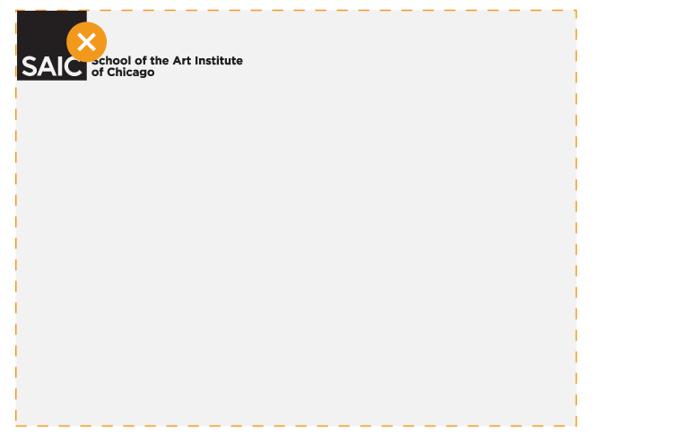
Avoid placing the logo flush against the edge.
LOGO USAGE
TO ENSURE THAT SAIC’S VISUAL IDENTITY REMAINS UNIFIED ACROSS ALL APPLICATIONS, DO NOT COMPROMISE THE LOGO AS SHOWN IN THESE EXAMPLES.

Do not stack the typography above the logo square.

Do not alter or skew the logo in any way.

Do not modify the logo square in any way.

Do not set the logo on an angle or arc.

Do not outline the logo, its square, or typography.

Do not reduce the logo to a width smaller than specified previously.

Do not attempt to re-create the logo or its typography.
TYPOGRAPHY
SAIC’S BRAND TYPOGRAPHY INCLUDES THREE TYPEFACES: GOTHAM (SANS SERIF: HEADLINES AND BODY COPY), LAVA (SERIF: HEADLINES AND BODY COPY), AND TRANSPORT (HEADLINES ONLY).
Gotham is available through the Font Request Form. Please contact communications@saic.edu for more information on purchasing typeface licenses.
BRAND TYPEFACES
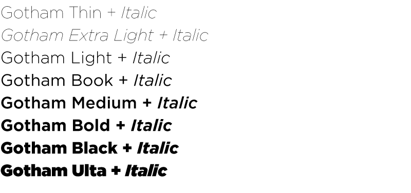
Gotham is SAIC’s main typeface. It is used in the logo and wordmark. The geometric, modern, sans serif typeface is perfect for both headline and body copy in print and the web.

Lava is the School’s main serif typeface. Its legibility makes it perfect for long amounts of body text on both print and digital platforms. It pairs well with one of the School’s other sans serif headline typefaces and works well at both small and large sizes.

Transport is a great alternative to Gotham for a sans serif, geometric headline to be displayed at larger sizes.
Leading
Appropriate leading (line spacing) is determined by the width of the column. The wider the column, the more open the leading should be. This is particularly important when using wide columns of body text.
For professionally typeset and printed publications, the minimum leading should be 2 points more than the size of the type (e.g., 9-point type on 11-point leading). The width of a column should be well considered. As the type size increases, a narrow column will force large gaps between words in justified text or cause an undesirable amount of hyphenated words when unjustified, or ragged text, is used.

Tracking

Justified Copy

Line Length

On external-facing, official materials, limit usage to two or three colors from the primary palette.
CMYK codes are reserved for print use (four-color process), RGB for digital use (TV, computer, mobile screens), and HEX codes for web design use.
PRIMARY COLOR PALETTE

YELLOW
CMYK: 5 | 8 | 100 | 0
RGB: 247 | 220 | 5
HEX: #F7DC05

ORANGE
CMYK: 0 | 45 | 99 | 2
RGB: 249 | 157 | 30
HEX: #F99D1E

PINK
CMYK: 0 | 99 | 3 | 0
RGB: 236 | 11 | 136
HEX: #EC0B88

VIOLET
CMYK: 71 | 80 | 13 | 0
RGB: 105 | 80 | 146
HEX: #695092

BLUE
CMYK: 71 | 28 | 0 | 0
RGB: 61 | 152 | 211
HEX: #3d98d3

TEAL
CMYK: 89 | 0 | 41 | 0
RGB: 0 | 176 | 171
HEX: #00B0AB

GRAY
CMYK: 15 | 0 | 12 | 70
RGB: 93 | 105 | 102
HEX: #5D6966

BLACK
CMYK: 0 | 0 | 0 | 100
RGB: 0 | 0 | 0
HEX: #000000
SECONDARY COLOR PALETTE

PURPLE
CMYK: 42 | 100 | 0 | 0
RGB: 159 | 36| 143
HEX: #9F248F

MARIGOLD
CMYK: 0 | 19 | 80 | 0
RGB: 255| 206 | 78
HEX: #FFCE4E

CORAL
CMYK: 0 | 72 | 40 | 0
RGB: 255 | 113 | 117
HEX: #FF7175

POPPY
CMYK: 0 | 90 | 100 | 0
RGB: 239 | 65 | 35
HEX: #EF4123

NAVY
CMYK: 94 | 71 | 39 | 25
RGB: 30 | 70 | 101
HEX: #1E4665

LIME
CMYK: 16 | 0 | 96 | 0
RGB: 225 | 227 | 39
HEX: #E1E327

BROWN
CMYK: 24 | 88 | 78 | 15
RGB: 169 | 59 | 58
HEX: #A93B3A
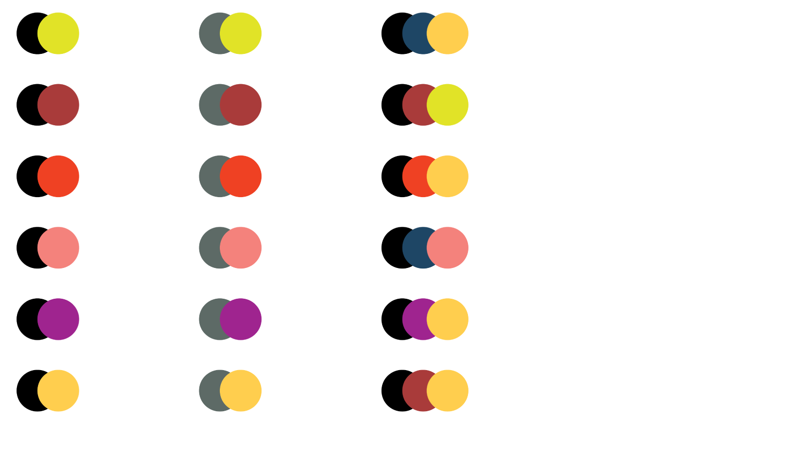
PRIMARY COLOR COMBINATIONS PAIRING EXAMPLES
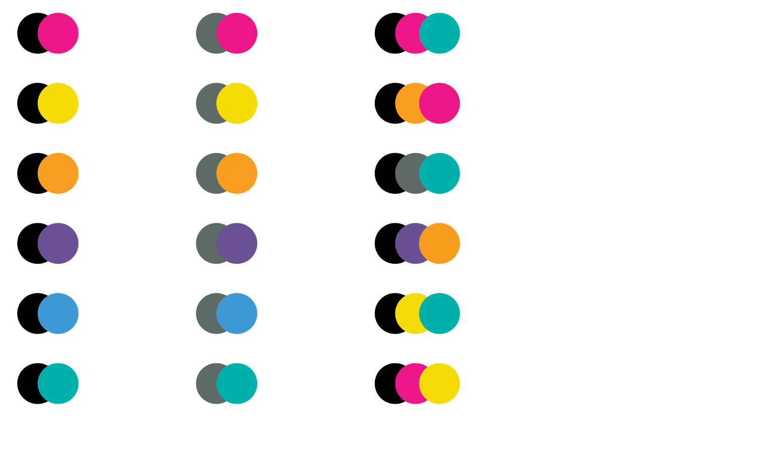
SECONDARY COLOR COMBINATIONS PAIRING EXAMPLES
