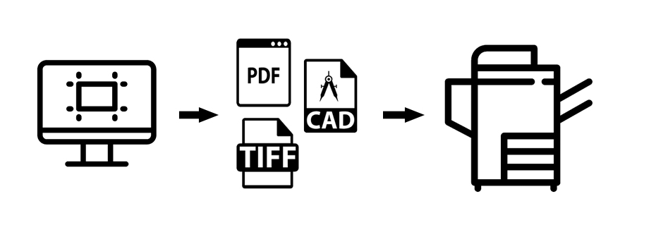
About Self-Service
Each project is different and achieving the highest print quality entails a process of experimentation and fine tuning. In the pursuit of perfection, you should be prepared to encounter challenges of print production that will require your own time and attention to detail, and may result in mistakes and lost materials and ink. Otherwise, a professional service like Service Bureau should be used for predictable and reliable results.
The Print Workflow
The workflow refers to the tasks – such as preflight checking and color management – that make sure that what is sent for output is accurate and correctly formatted for the destination printer.
Taking the right steps to control your desired output is called the “print workflow.” The more thorough your preparation, the more effective your print project will be, so the execution of any print project must be carefully planned.
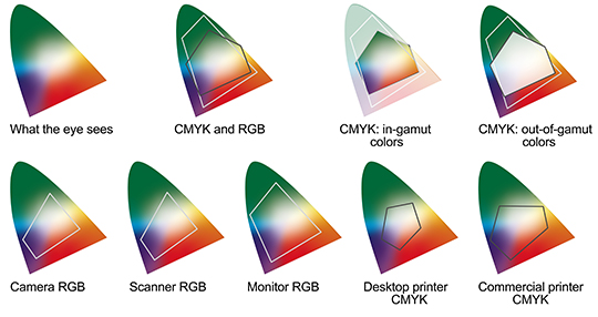
Color Management
RGB versus CMYK
Spot Colors
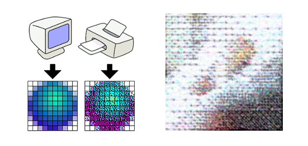
The Structure of Digital Images
Data Bits, Pixels, Ink Dots and Density
Printers do not reproduce an image by tiling pixel squares directly on top of one another. Rather, they reproduce an image by spitting out tiny dots consisting of a mix of four colors, Cyan, Magenta, Yellow and Key (black) – or sometimes more – which combine to create a range of hues by the subtractive color model.
There is bound to be some space between these dots, and this is what DPI measures: their density. For example, if you are printing a 150ppi image at 600dpi, each “pixel” will consist of 16 dots (600 dots/150 “pixels” = 4 rows of 4 dots per “pixel”).
Raster versus Vector
Conversion Risks of Strokes, Outlines and Blending Transparencies
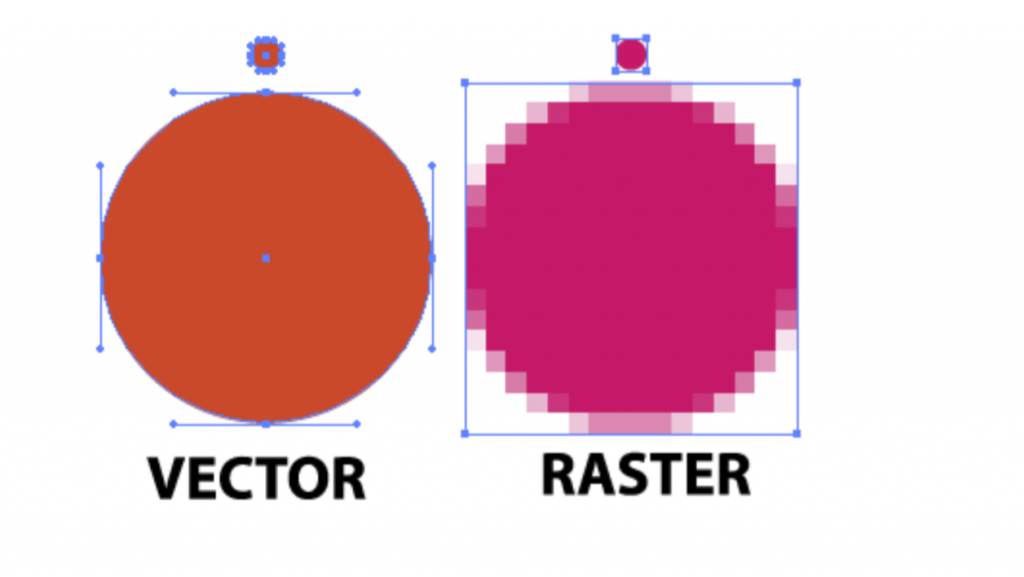
Image Resolution, Transparencies and Sampling
Conversion Risks of Strokes, Outlines and Blending Transparencies
Rendering Intents
Relative Colormetric
Compares the extreme highlight of the source color space to that of the destination color space and shifts all colors accordingly. Out-of-gamut colors are shifted to the closest reproducible color in the destination color space. Relative Colorimetric preserves more of the original colors in an image than Perceptual. This is the standard rendering intent for printing in North America and Europe.
Perceptual
Saturation
Tries to produce vivid colors in an image at the expense of color accuracy. This rendering intent is suitable for business graphics like graphs or charts, where bright saturated colors are more important than the exact relationship between colors.
Absolute Colormetric
Color across Platforms
Synchronize your Adobe Settings
